[Relativity FAQ] - [Copyright]
[Top] [Intro] [Prev] [Next]"Your Honor, I will show first, that my client never borrowed the Ming vase from the plaintiff; second, that he returned the vase in perfect condition; and third, that the crack was already present when he borrowed it."Or to quote Shakespeare: "Methinks the lady doth protest too much."
Why so many different explanations? Are the relativists just trying to bamboozle their opponents? To prevail, a defense attorney just has to stir up doubt about the plaintiff's case; she's not required to give her own theory of what happened. But a physical theory should tell a single coherent story.
Relativity here pays the price of permissiveness. It says to us, "Pick whichever frame you like to describe your results, or use spacetime diagrams and don't choose a reference frame at all. They're all equivalent, I don't mind." No wonder that one explanation ends up looking like three or four.
Most physicists feel that the Spacetime Diagram Explanation is the most fundamental. It does amount to a sort of "Universal Interlingua", enabling one to see how superficially different explanations are really at heart the same.
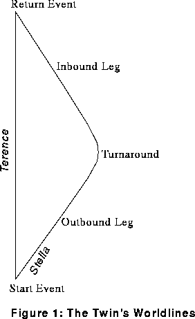
Figure 1 is the basic spacetime diagram for our hero and heroine. By adding lines one way or another, we will get all the various explanations. (Oh yes: choose units so that c=1 throughout. So light rays graph as 45 degree diagonal lines in all our diagrams.)
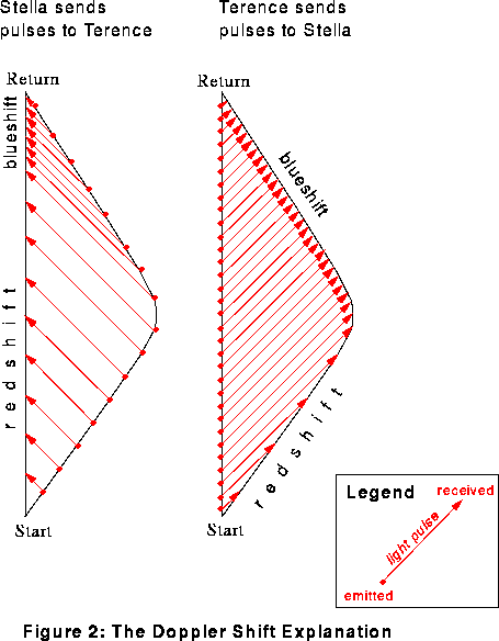
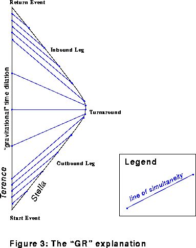
Figure 3, the diagram for the "GR" Explanation, adds lines of simultaneity (in blue) instead of light pulses.
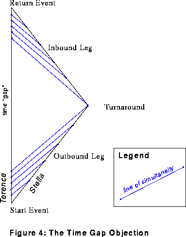
Modify Figure 3 slightly, and we have a portrayal of the Time Gap Objection (Figure 4).
These are just a few of the ways we can decorate our simple diagram with extra lines. In the laissez-faire spirit of General Relativity, we could cover the diagram with almost any network of grid lines, and base a description on the resulting coordinate system. (I hasten to add that there are some pitfalls for the unwary: see Section 6.3 of Misner, Thorne, and Wheeler for the fine points.)
One territory, many charts.